Ask LinkedIn Lindsey: Profile Imagery
Dec 16, 2025
Your LinkedIn profile is more than a static resume. It’s time to forget boring, black Times New Roman text and embrace all the dynamic visual features LinkedIn offers to showcase who you are. Because there are so many different ways to incorporate imagery into your LinkedIn profile, choosing a starting point can be overwhelming. With a little encouragement, though, I hope you find the freedom you need to embrace your profile as a space to be creative. Check out these popular questions and my recommendations for expressing your professional story through imagery on LinkedIn.
Q: I spent a lot of time writing my LinkedIn profile. Do I really need to add imagery?
A: The short answer is, “yes.” We’re visual creatures by nature, so it’s important to consider where throughout your LinkedIn profile you can capture attention with great imagery. A 2022 study from Hearsay Systems found that financial services professionals who focus on personal yet professional content on their social media accounts are better able to connect with prospects. Great visuals are an important way to give your viewers a clear picture of what it’s like to work with you. Plus, you never know what might resonate with someone. Some will be readers, and others will connect with more photos and videos.
Q: I want to add some visual interest to my profile. Which sections should I update?
A: There are several key spots throughout your profile where you’ll want to focus your attention (although LinkedIn is always adding new features).
-
At a minimum, don’t neglect your Background Photo and Profile Photo.
-
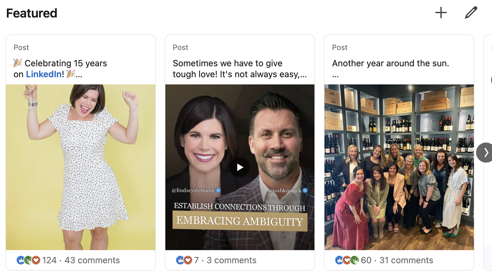
The Featured section of your profile also offers prime real estate to highlight images, videos, or links.
-
The same is true for the Media section of any role description in your Experience section.
To the extent possible, also ensure that the correct organization or company logos populate in your profile. This pertains especially to your Experience, Education, Licenses & Certifications, and Volunteering sections. Finally, while it’s not the right choice for everyone, adding emojis to your Headline adds an additional pop of visual interest. (Below is a previous version of my headline as an example.) 
Q: It’s time for a new headshot. Any guidelines I should keep in mind?
A: Good for you for updating your headshot! I recommend swapping out your LinkedIn profile photo at least every other year or, preferably, every 12 to 18 months. Before you select a new option, ask yourself these three questions:
-
Do I look the same now as I do in this photo?
-
Am I the only one featured in the photo?
-
Is this photo clear and high-quality?
If the answer to all these questions is “yes,” you’re in great shape. Stuck on what to wear? I recommend choosing an outfit that’s representative of how your clients, colleagues, or vendors could expect to see you in the course of a normal workweek.
Bonus tip: Don’t forget to smile! Looking approachable is critical, especially when someone hasn’t had a chance to speak with you yet.
Q: What kind of photography would you recommend including in my profile?
A: Consider this your permission to get creative about the kind of imagery you include on LinkedIn. While everything you feature on your profile should be filtered through a professional lens, there’s certainly room to get personal, too. Some categories of photography you might consider include:
-
Team
-
Speaking
-
Volunteering
-
Professional Events
-
Work in Action (e.g. teaching clients)
-
Family
-
In the Community
Remember, LinkedIn is not Facebook. If you choose to post your family vacation, be sure it has a purposeful, professional undertone. For example, I’ve posted my fly-fishing adventures on LinkedIn because they have been a great way for me to disconnect and recharge so that I can show up even better for my team and my clients. 
Q: Some of the LinkedIn images I added look like they now need to be reformatted. How can I prevent broken links and cut-off images in the future?
A: Before you “launch” any new imagery on your profile, be sure to take a look at how it will appear to your profile visitors. (Since there’s no draft version of LinkedIn, you’ll need to test each image and delete it if it doesn’t work.) Avoid blurry imagery and watch out for strange crops or missing images. This is particularly important for photos that auto-populate via links. Unfortunately, even if the thumbnail image looked great when you added it to your profile, changes outside your control could affect the way the image looks later. It’s best practice to check your imagery (including logos) throughout your profile at least once per quarter to catch and update any broken links or missing files.
Updating your LinkedIn profile with great imagery that captures who you are doesn’t have to be a chore. Have fun with it! As long as you remember to keep it classy, sharp, and engaging, you can let your creativity run wild. While you’re in profile updating mode, don’t forget to check out my free Rock Your LinkedIn Profile Guide. Sign up for instant digital access to my top tips to improve one of the most important professional profiles you own. With my guidance, you can ensure that your awesome offline reputation is mirrored online.


